Alan
Lee (20 August 1947) is an English book illustrator and movie conceptual designer. He was born in Middlesex, England and studied at the Ealing
School of Art. He has illustrated many fantasy books including several works of J.R.R. Tolkien: the centenary edition of The
Lord of the Rings (1991), a 1995
edition of The
Hobbit, and the first edition of Narn i
Chîn Húrin: the tale of the children of Húrin (2007). This
meant he was perfectly suited to become one of the lead concept artists for
Peter Jackson’s Lord of the Rings films alongside John Howe. Lee has
also worked as a concept artist on films such as Legend, Erik the Viking, King
Kong and the television
mini-series Merlin.
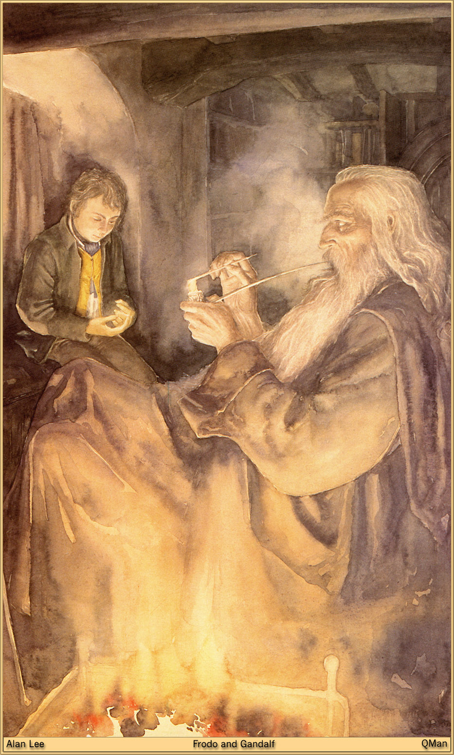
Alan Lee
works exclusively with fine art mediums and this particular piece of artwork
entitled ‘Frodo and Gandalf’ was created using water colour paints. He painted
it in 1991 to illustrate the reissued edition of The Lord of the Rings which celebrated the 100th anniversary of the
birth of Tolkien. Lee interpreted what
Tolkien had written to create the painting; ‘He was
smoking in silence, for Frodo was sitting still, deep in thought. Even in the
light of morning he felt the dark shadow of the tidings that Gandalf had
brought.'
The
painting depicts Gandalf the wizard smoking a pipe by the fire in the Hobbit
hole; Bag End with the hobbit Frodo Baggins sitting nearby deep in thought. The
fire takes up a large portion of the foreground and some of the hobbit’s home
can be seen in the background.
Lee uses
a variety of art elements effectively to create such a captivating painting. He
uses thin wispy lines to create the textured look of hair and the detail on
clothes. The figures he has depicted are
lifelike and well proportioned, he has given them real character; the white
flowing hair, the piercing eyes and the crooked nose makes Gandalf seem old and
wise as you would imagine a wizard to
be. Lee has minimised the empty space in
the painting, the majority is taken up by the two characters, meaning the focus
is on them and the gravity of their situation is fully expressed through their
clearly visible facial expressions.
The
textures in the painting are predominantly rough with the thick clothing
material and textured stone and wood giving the painting a charmingly old
fashion quality. The colours are warm
and complimentary of each other, giving the painting a cosy, inviting
feel. There is a fairly wide range of
tones in the painting, from dark shadow towards the back of the room to the
bright fire which illuminates the characters and adds to the warm, relaxed
feeling the painting creates. The white
colour of the fire creates the illusion of heat and the glow that it casts onto
the characters minimises the need for detail in the foreground and throws
shadows across areas of the painting, adding to the intensity of the piece.
There is
a real depth to Lee’s painting with the fire in the foreground, the characters
in the mid ground and details of the house in the background. This makes the painting seem more three
dimensional and sets the scene perfectly.
The body language and facial expressions makes the characters seem still
and silent, clearly deep in thought.
There is a real emphasis on the characters’ grave faces with the light
illuminating them well.
The
painting was intended to illustrate an edition of Lord of the Rings, so it therefore adheres to Tolkien’s incredible
vision and makes his descriptions come alive.
Being an illustration, the painting is unlikely to have any hidden
meanings or symbols. The book belongs to
the Fantasy genre, so Lee’s painting is in keeping with this, the setting and
clothing emphasising the old fashioned feel that is common to fantasy
books.From a viewer’s point of view I
find the painting warm and comfortable to look at, however there appears to be
an underlying sense of fear. Regardless
of the story behind the painting, it is very aesthetically pleasing.
Alan
Lee’s painting greatly appeals to me, both because I am a fan of the book the
painting illustrates and because the painting is captivating in its own
right. I really like the sense of depth
the painting has which makes it appear three dimensional and interesting to
look at. I also think the use of
lighting is very strong; it adds a diversity of tone and makes it bold and
eye-catching. When creating my own concept artwork I will try to mimic the
emphasis on composition that Lee has displayed here as well as the high level
of detail and realism.